

Leopard print wallpaper is the fastest way to take a room from forgettable to unforgettable. One wall of those golden rosettes and suddenly the space has confidence, warmth, and a story to tell. But leopard is a strong personality — used carelessly it can overwhelm, used well it looks expensive and intentional.
The secret is balance. Leopard print works best when it is the star and everything else plays a supporting role: calm furniture shapes, solid colours pulled from the print, and lighting that flatters the pattern instead of fighting it. Think of the wallpaper as jewellery for the room — you wouldn’t wear a necklace, earrings, bracelet, and tiara all at once.
This guide walks you through a full leopard print room makeover step by step, from choosing the right print scale to the final styling touches. Follow it in order and you’ll get a room that feels bold and grown-up, never chaotic.
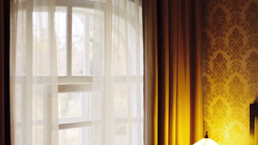
Choose the Right Leopard Print Scale
Not all leopard prints are equal, and scale changes everything. A large, widely spaced rosette reads modern and calm; a small, dense print feels busier and more traditional. For a makeover with real impact, a medium-to-large scale print is the sweet spot — it reads clearly from across the room without turning into visual noise.
Picking your print:
● Hold a sample at arm’s length: if you can count individual spots easily, the scale works for a feature wall.
● Small rooms suit slightly smaller prints; large rooms can take oversized rosettes with confidence.
● Look for prints with breathing room between spots — dense all-over coverage is harder to live with.
● Order large samples, not tiny swatches, and tape them to the wall for at least two days before deciding.

Decide Where the Print Goes
The classic move is one feature wall — usually behind the bed or sofa — with the other walls in a calm solid pulled from the print. This gives you maximum drama with minimum risk, and it frames the furniture beautifully. Full-room leopard can work in a small powder room or a hallway, where you pass through rather than sit for hours.
Placement that works:
● Bedrooms: the wall behind the headboard, so the print acts as a giant piece of art.
● Living rooms: the wall behind the sofa or fireplace for a natural focal point.
● Small spaces: wrapping all four walls in a cloakroom or entry makes it feel like a jewel box.
● Avoid papering the wall with the window — backlighting flattens the print and wastes the effect.
Pull Your Colour Palette From the Print
A leopard print already contains your whole colour scheme: warm golds and tans, rich browns and black, plus the background tone. Build the room from those colours and everything will feel connected. The easiest formula is one background colour for the other walls, one dark accent from the spots, and one warm metallic for details.
Building the palette:
● Match the wallpaper background for the remaining walls — cream, warm white, or soft beige.
● Use the darkest spot colour (usually near-black brown) for small accents like frames or lamp bases.
● Add warmth with brass, gold, or cognac leather — metallics love leopard print.
● Keep at least sixty percent of the room in calm solids so the print has room to breathe.

Keep Furniture Simple and Solid
When the walls are this confident, the furniture should be quiet. Clean-lined sofas, simple upholstered headboards, and unfussy wooden pieces let the wallpaper do the talking. Upholstery in solid velvet, linen, or leather works beautifully against the print — avoid competing patterns like stripes or florals in the same sightline.
Furniture rules for bold walls:
● Choose solid upholstery in cream, camel, chocolate, or black — colours borrowed from the print.
● Let one curved piece, like a rounded armchair, soften the graphic energy of the spots.
● Keep wood tones warm: walnut, oak, or rattan echo the golden tones in the wallpaper.
● If you love pattern mixing, limit it to small doses — a single cushion in a tiny geometric, nothing more.
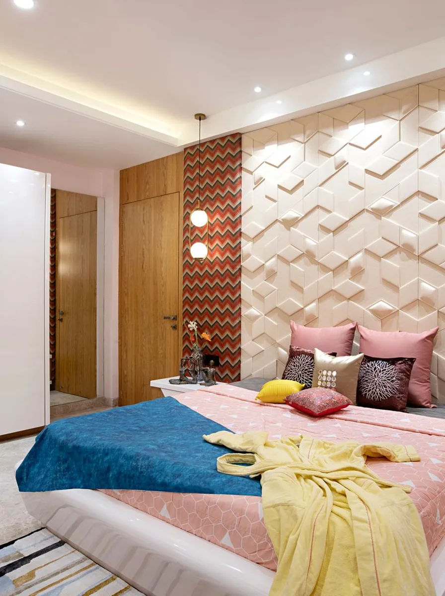
Light It Warmly and Layer It
Leopard print glows under warm light and can look flat under cool white bulbs, so lighting matters more than usual. Layer a warm overhead, a table lamp or two at sitting height, and something low like candles for evening. The golden tones in the print come alive around 2700K — the same warmth as candlelight.
Lighting that flatters the print:
● Swap any cool-white bulbs for warm 2700K throughout the room before you judge the wallpaper.
● Picture lights or wall washers aimed at the feature wall make the print look rich after dark.
● Brass or black lamp bases tie into the palette; avoid chrome, which fights the warm tones.
● A dimmer on the main light lets you shift from bright daytime to moody evening in one slide.

Style the Final Layer With Restraint
The last step is styling, and restraint is everything. A leopard wall plus carefully chosen solids already says plenty, so edit hard: a tall vase with branches, a stack of books, one sculptural object. Greenery is leopard’s best friend — the organic shapes soften the graphic print and the green pops against the gold.
Finishing touches:
● Add one large plant or tall stems; green against leopard is a classic designer pairing.
● Hang art on the plain walls, not the print wall — the wallpaper is already the artwork.
● Photograph the room on your phone to spot clutter your eyes have learned to ignore.
● Live with it for a week before adding anything; bold rooms reveal what they need slowly.