

Mixing colours in a bedroom feels risky, but it follows simple rules anyone can learn. The best combinations aren’t random — they pair one lead colour with one or two supporting tones, and they repeat each colour at least twice so the room feels planned rather than accidental.
Most people go wrong by either playing it too safe (everything beige, nothing interesting) or throwing colours together with no plan. There’s a happy middle: a short list of combinations that are proven to work, plus a simple formula for inventing your own.
In this guide you’ll learn the easiest pairing formulas, how to use an accent wall without regret, and four colour combinations that work beautifully in real bedrooms.
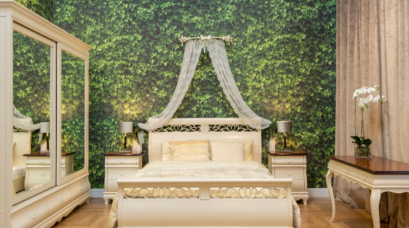
Pick a Lead Colour and a Supporting Cast
Every great combination starts with roles: one lead colour (about 60% of the room), one supporting colour (30%), and one accent (10%). The lead is usually the wall or bedding colour, the support is the secondary textile or furniture tone, and the accent is the small pop — cushions, art, or a lamp.
This 60-30-10 split is the oldest trick in interior design because it guarantees balance. The lead gives the room its identity, the support keeps it comfortable, and the accent keeps it interesting. Break the ratio — say, 40-40-20 — and the room starts to feel indecisive, like two colours arguing.
The 60-30-10 rule in practice:
● Choose the lead first — it’s the colour you’ll see most, so love it.
● The supporting colour should sit calmly next to the lead; neutrals like white, beige, and grey are safe.
● Keep the accent bold but tiny — a little goes a long way.
● Write your three colours on a card and check every purchase against it.
● When in doubt, make white or cream the support — it gets along with everything.
Yellow and White for Cheerful Energy
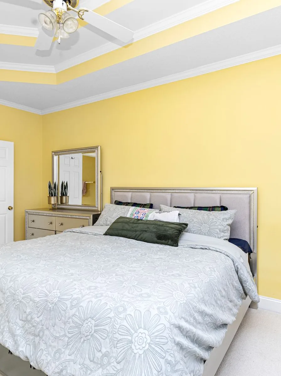
Yellow and white is the happiest bedroom combination there is. Yellow brings sunshine energy while white keeps it fresh and clean — together they make mornings feel brighter, which is exactly what a bedroom should do. This pairing works best in rooms that get good daylight, where the yellow truly glows.
There’s real psychology behind it: yellow is the colour most associated with optimism and energy. In a bedroom, a little of that morning lift is welcome — as long as the yellow stays soft enough not to overstimulate at night. That’s why butter and honey tones beat neon every time.
Making yellow and white work:
● Choose a soft butter yellow over a harsh primary yellow — it’s easier to live with.
● Keep bedding mostly white with yellow in the throw and cushions for balance.
● Add light wood furniture to warm the combination up.
● If full yellow walls feel bold, try yellow on one wall behind the bed only.
● In the evening, warm lamplight deepens yellow beautifully — test your shade at night too.
Modern Yellow with Clean Lines
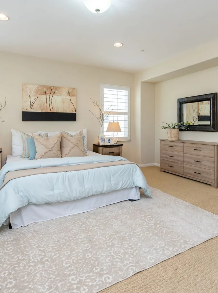
Yellow also works in a modern bedroom when you keep the shapes clean. A mustard or ochre accent wall with simple, straight-lined furniture feels contemporary rather than childish. The trick is letting the colour be the decoration — no fussy patterns needed, because the colour itself is the statement.
Modern style is really about confidence and restraint, and mustard yellow delivers both. It’s bold enough to carry a room on its own, which means everything else can stay quiet: plain bedding, simple frames, clean surfaces. The room looks designed rather than decorated.
Modern yellow done right:
● Pair mustard tones with charcoal grey or black for a sharp, modern contrast.
● Keep bedding simple — white or grey lets the yellow wall do the talking.
● Use geometric cushions in black, white, and yellow for a pulled-together look.
● One piece of abstract art that includes your yellow ties the whole room together.
● Matte paint finishes look more modern than glossy ones with strong colours.
Mint Green with Crisp White
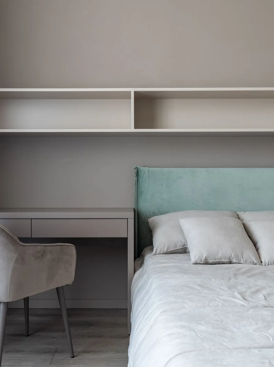
Mint green and white is the freshest combination on this list. Mint feels clean and calming — like a breath of fresh air — while white keeps it bright and crisp. It’s a brilliant choice if you want colour without any risk of the room feeling heavy or dark.
Mint has another advantage: it’s one of the few colours that feels both cool and soft at the same time. That makes it incredibly versatile — it suits modern rooms, vintage rooms, and everything between. It also pairs naturally with plants, wood, and rattan, so styling around it is effortless.
Fresh mint combinations:
● Mint walls with white bedding is the classic version and it always works.
● Add natural textures — rattan, linen, light wood — to stop mint feeling cold.
● A few green plants echo the wall colour and make the combination feel alive.
● For a bolder take, pair mint with soft peach accents — they’re gentle complements.
● Keep metals light and bright — chrome or brushed nickel suits mint better than brass.
Pink with Soft Neutrals
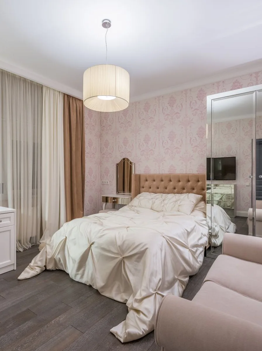
Pink becomes sophisticated the moment you pair it with soft neutrals. Blush pink with warm beige, greige, and cream feels grown-up and calm — nothing like the bubblegum pink of a child’s room. This combination suits bedrooms perfectly because it’s both warm and restful, flattering in morning light and soothing at night.
The sophistication comes from restraint. Pink on its own can feel sweet; surrounded by quiet neutrals, it reads as warm and elegant. The neutrals do the calming work while the pink provides the personality — a perfect division of labour.
Elevating pink with neutrals:
● Use pink as the mid-tone and surround it with lighter creams and deeper taupes.
● Brushed gold or brass details lift pink-and-neutral schemes beautifully.
● Keep patterns subtle — tone-on-tone texture beats bold prints here.
● A dark wood or black frame on art adds just enough contrast to keep it interesting.
● Layer two pinks — blush and a deeper rose — for depth without new colours.