

The right wall art can lift a dining room from plain to polished in an afternoon. But choosing art feels risky — too small and it looks timid, too bold and it fights the room, too bland and it adds nothing. The truth is that great art choices follow simple rules about scale, subject, and placement.
This guide gives you a decision framework, not just inspiration. You’ll learn how to size art to your furniture, pick subjects that suit dining rooms, choose frames that elevate, hang everything at the right height, and avoid the five mistakes that make art look wrong.
Think of it as a recipe: follow the steps in order and you’ll end up with art that looks like a designer chose it — even if you picked it up on a Saturday morning.
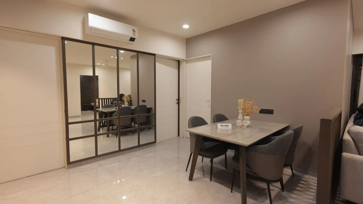
Size It to the Furniture
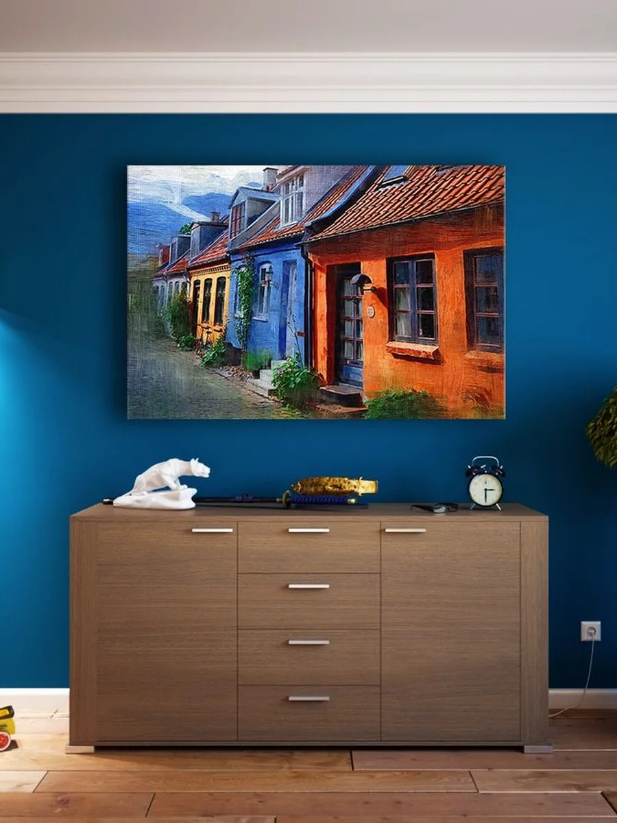
Scale is the number-one art rule, and most people get it wrong by going too small. Art should relate to the furniture below it: aim for a piece (or grouping) that’s roughly two-thirds the width of the sideboard or table beneath. A postage-stamp print floating on a big wall always looks lost.
Sizing made simple:
● Measure the furniture width, multiply by 0.65 — that’s your target art width.
● When in doubt, go one size up; oversized art looks confident, undersized looks apologetic.
● For very wide sideboards, a pair or trio of matching pieces can span the width better than one.
● Leave at least 15–20cm between the top of the furniture and the bottom of the art.
● If you already own art that’s too small, add a wide mount and a larger frame — it visually doubles the presence.
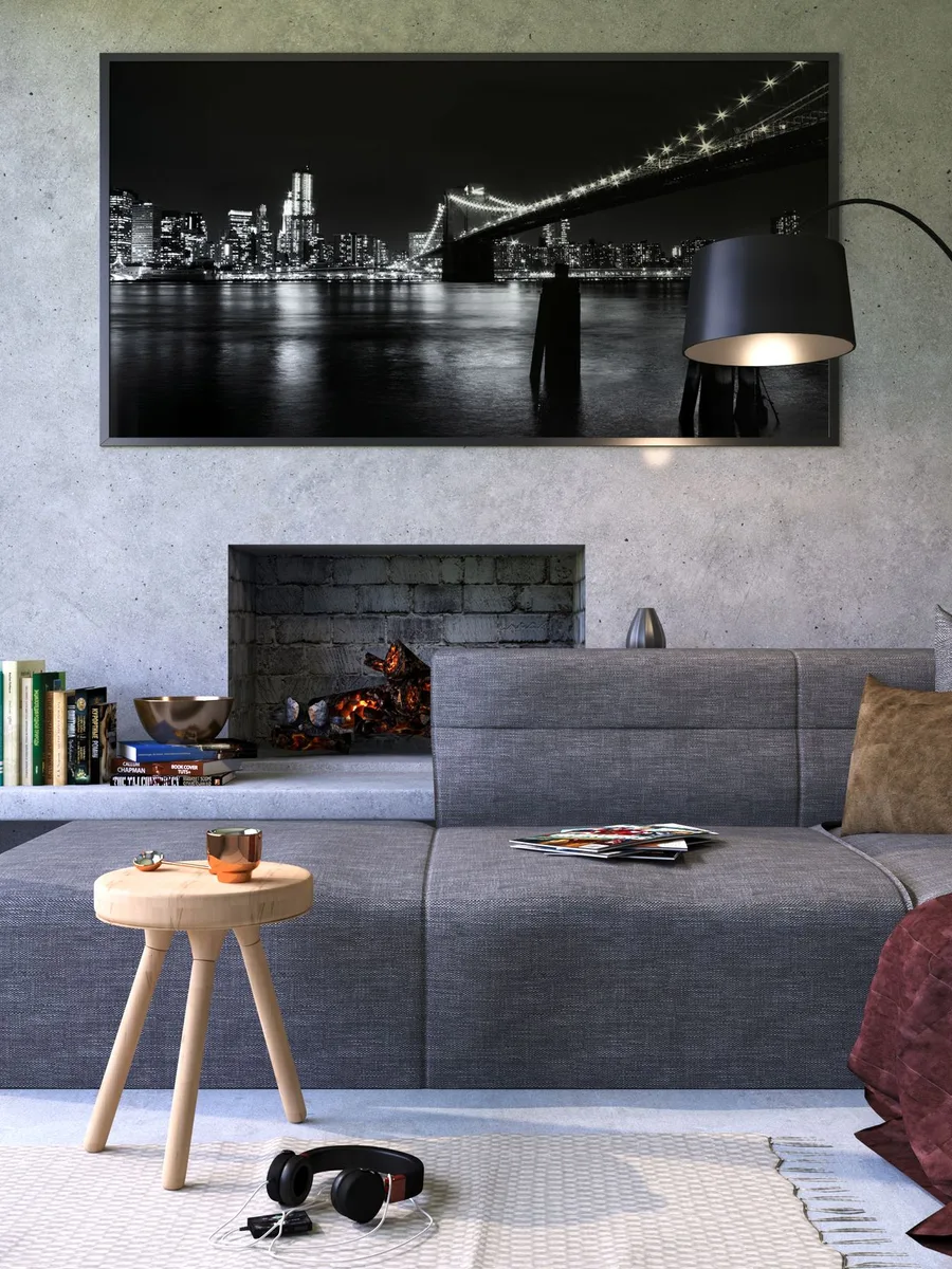
Pick Subjects That Suit Dining
Dining rooms are social, sensory spaces — the art should feel welcoming, not demanding. Calm abstracts, landscapes, botanical prints, and black-and-white photography all work beautifully. Avoid anything jarring, overly busy, or melancholic; nobody wants to stare at something unsettling over dinner.
Subjects that elevate:
● Soft abstracts in the room’s palette tie the whole scheme together effortlessly.
● Food-adjacent art — botanical prints, vintage market posters, still lifes — feels natural in a dining room.
● Black-and-white photography adds sophistication and suits almost any style.
● Skip anything too dark, chaotic, or text-heavy; dining art should soothe, not shout.
● When choosing between two pieces you love, pick the calmer one — dining rooms reward serenity over drama.
Invest in Frames and Mounts
Framing is where affordable art becomes impressive art. A wide, clean mount and a quality frame can make a £10 print look like a £200 piece. The mount matters as much as the frame — generous white space around the image gives it a gallery calm that cheap, tight framing never achieves.
Framing that elevates:
● Choose mounts at least 5–8cm wide; narrow mounts look mean and cramped.
● Black frames suit modern rooms, oak warms up neutrals, brass adds a luxe note.
● Use anti-reflective or museum glass if the art faces a window — glare ruins the effect.
● Frame everything in the room consistently; matching frames unify even wildly different art.
● A good framer is worth the money for your one hero piece — it protects the art and transforms how it reads.
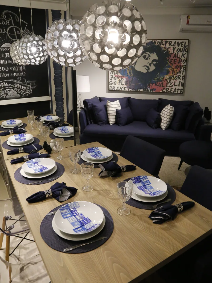
Hang It at the Right Height
Most art hangs too high. In a dining room, people are seated, so art should be lower than in a hallway — centre it around 140–145cm from the floor, or 15–25cm above the sideboard. Art that’s in conversation with the furniture below looks intentional; art floating near the ceiling looks like an afterthought.
Hanging heights that work:
● Centre of the piece at 140–145cm suits seated viewers perfectly.
● Above a sideboard, leave a hand’s width (15–25cm) between furniture and frame.
● For pairs, treat them as one unit and centre the whole arrangement.
● Use two hooks or a wire for wide pieces — one nail lets them tilt over time.
● When hanging above a table, make sure seated diners can’t knock it — 20cm clearance is the safe minimum.
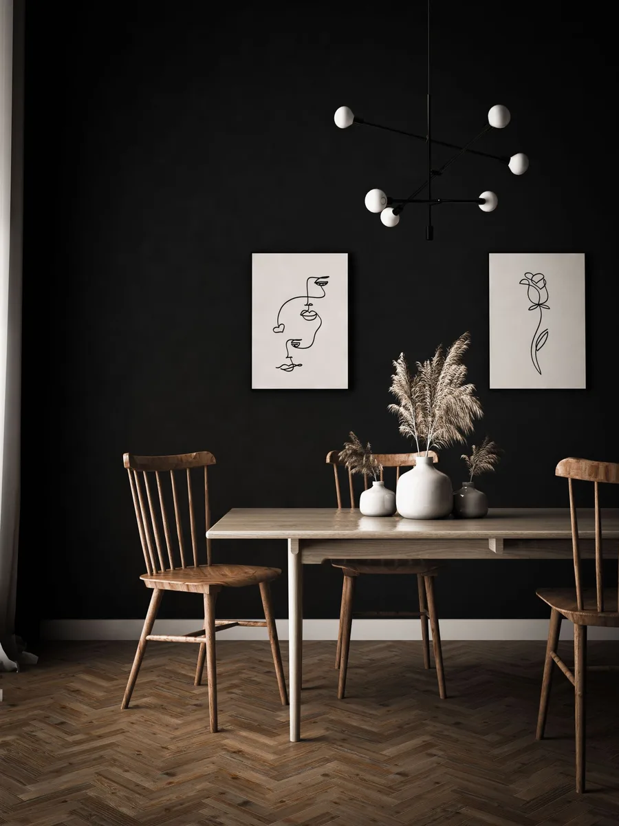
Light It Like It Matters
Art you can’t see properly might as well not be there. A slim picture light, a directional ceiling spot, or even good daylight placement transforms how art reads in the evening — colours deepen, textures emerge, and the piece becomes a true focal point. Unlit art disappears after dark.
Lighting your art:
● Battery or plug-in picture lights need no wiring and take ten minutes to fit.
● Warm 2700K light flatters art; cool light can make colours look harsh and wrong.
● Angle spots at 30 degrees to the wall to light the art without glare.
● If the art is behind glass, light it from the side rather than straight on to avoid reflections.
Avoid the Five Classic Mistakes
Finally, a quick checklist of what not to do. These five errors undo more dining rooms than any lack of budget: hanging too high, choosing too small, mixing clashing frames, ignoring lighting, and overfilling the wall. Fix these and almost any art choice looks good.
The mistake checklist:
● Too high: if you have to look up from your chair, lower it.
● Too small: if the wall dwarfs the art, size up or group it.
● Clashing frames: pick one frame style per room and commit.
● No lighting: add a picture light before buying more art.
● Too much: one wall, one moment — let the art breathe and the room will thank you.