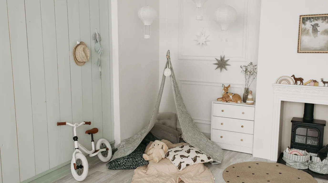
Colour is the soul of a nursery. Before the furniture arrives and the decor goes up, the palette you choose determines whether the room feels calm or chaotic, warm or cold, timeless or trendy. Getting colour right is the single most important design decision you’ll make.
Babies experience colour differently from adults — high-contrast brights can overstimulate a newborn, while soft, muted tones support rest and calm. That doesn’t mean boring: the most beautiful nurseries use sophisticated, layered colour that delights adults while soothing babies.
In this guide, you’ll learn how to choose the perfect colour palette for your baby’s room — understanding undertones, building foolproof combinations, balancing neutrals with accents, and avoiding the colour mistakes that make nurseries feel off.

Understand Undertones Before You Choose
Every “neutral” has a hidden undertone — pink, yellow, blue, or green — and undertones make or break a palette. A grey with blue undertones feels cold and crisp; the same grey with warm beige undertones (greige) feels cosy. In a nursery, warm undertones almost always win.
Test colours in the actual room before committing. Paint large swatches on poster board and move them around at different times of day — morning light, afternoon sun, and lamplight each reveal different undertones. What looks perfect in the shop can feel completely different at home.
Undertone wisdom:
● Warm undertones (yellow, pink, peach) = cosy and inviting — ideal for nurseries.
● Cool undertones (blue, grey-green) = crisp but can feel cold; use carefully.
● Compare swatches against pure white to reveal hidden undertones.
● Keep all your neutrals in the same undertone family for harmony.
Start With Foolproof Palette Formulas
Choosing colours is easier with a formula. The classic 60-30-10 rule works beautifully in nurseries: 60% dominant neutral (walls, large furniture), 30% secondary tone (rug, curtains, bedding), 10% accent colour (art, cushions, decor). This ratio keeps rooms balanced almost automatically.
Try these proven nursery combinations: warm white + oatmeal + sage; cream + soft grey + dusty rose; greige + white + muted terracotta; pale blue-grey + cream + natural wood. Each uses calm neutrals with one gentle accent — sophisticated, restful, and hard to get wrong.
Palette formulas that work:
● Warm white walls + beige textiles + sage accents: fresh and calming.
● Cream + soft grey + blush: sweet without being sugary.
● Greige + white + terracotta: earthy and modern.
● When in doubt, go more neutral — you can always add colour later.
Balance Neutrals With Thoughtful Accents
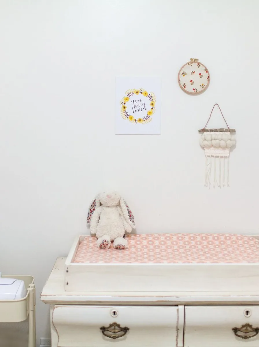
Neutrals are the backbone, but accents are the personality. The key is restraint: one or two accent colours, repeated in several places, create cohesion. Scatter an accent colour once and it looks accidental; repeat it three times and it looks intentional.
Choose accent colours in muted, dusty versions rather than pure brights — dusty rose instead of hot pink, sage instead of kelly green, slate instead of royal blue. Muted tones feel calm and sophisticated while still adding life. And keep the boldest accents in easily changed items: cushions, art, and small decor.
Accent colour strategy:
● Pick 1–2 accents max; more than that feels chaotic.
● Repeat each accent at least 3 times around the room.
● Muted and dusty beats bright and pure in nurseries.
● Put bold colour in textiles and art — never in expensive furniture.
Consider Colour Psychology for Sleep
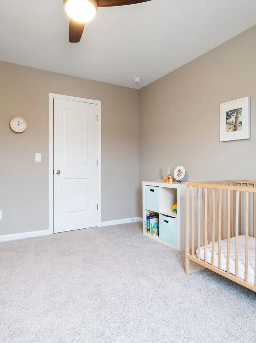
Colour genuinely affects how we feel, and in a room built for sleep, that matters. Soft blues and greens are scientifically calming — they lower heart rate and ease anxiety. Warm neutrals feel safe and cosy. Even gentle yellows can feel cheerful without being stimulating, as long as they’re muted.
Avoid large areas of intense colour: bright red or orange walls can agitate rather than soothe, and neon anything has no place in a sleep space. If you love a bold colour, use it as a small accent and keep the overall environment soft.
Sleep-friendly colour guide:
● Soft blue and green: the most calming choices — ideal for walls.
● Warm whites and creams: safe, cosy, and endlessly versatile.
● Muted yellow or peach: cheerful in small doses.
● Save brights for tiny accents; keep sleep zones soft.
Avoid the Palette Mistakes Everyone Makes

A few common mistakes trip up nursery palettes. Too many colours is the biggest — five competing hues feel chaotic no matter how pretty each is alone. Clashing undertones is the sneakiest — a pink-beige rug with a yellow-beige wall looks “off” without anyone knowing why. And going too dark can make the room feel heavy rather than cosy.
The fix is always simplification: remove one colour, align your undertones, lighten up. A nursery with three harmonious colours beats one with six clashing ones every time. When the palette is right, everything else — furniture, decor, art — falls into place effortlessly.
Mistakes to avoid:
● Too many colours: cap the palette at 3–4 total.
● Mixed undertones: keep warms with warms, cools with cools.
● Stark white everywhere: it feels clinical — warm it up.
● Forgetting the ceiling: a soft white ceiling reflects light and completes the palette.
Test, Live With It, Then Commit
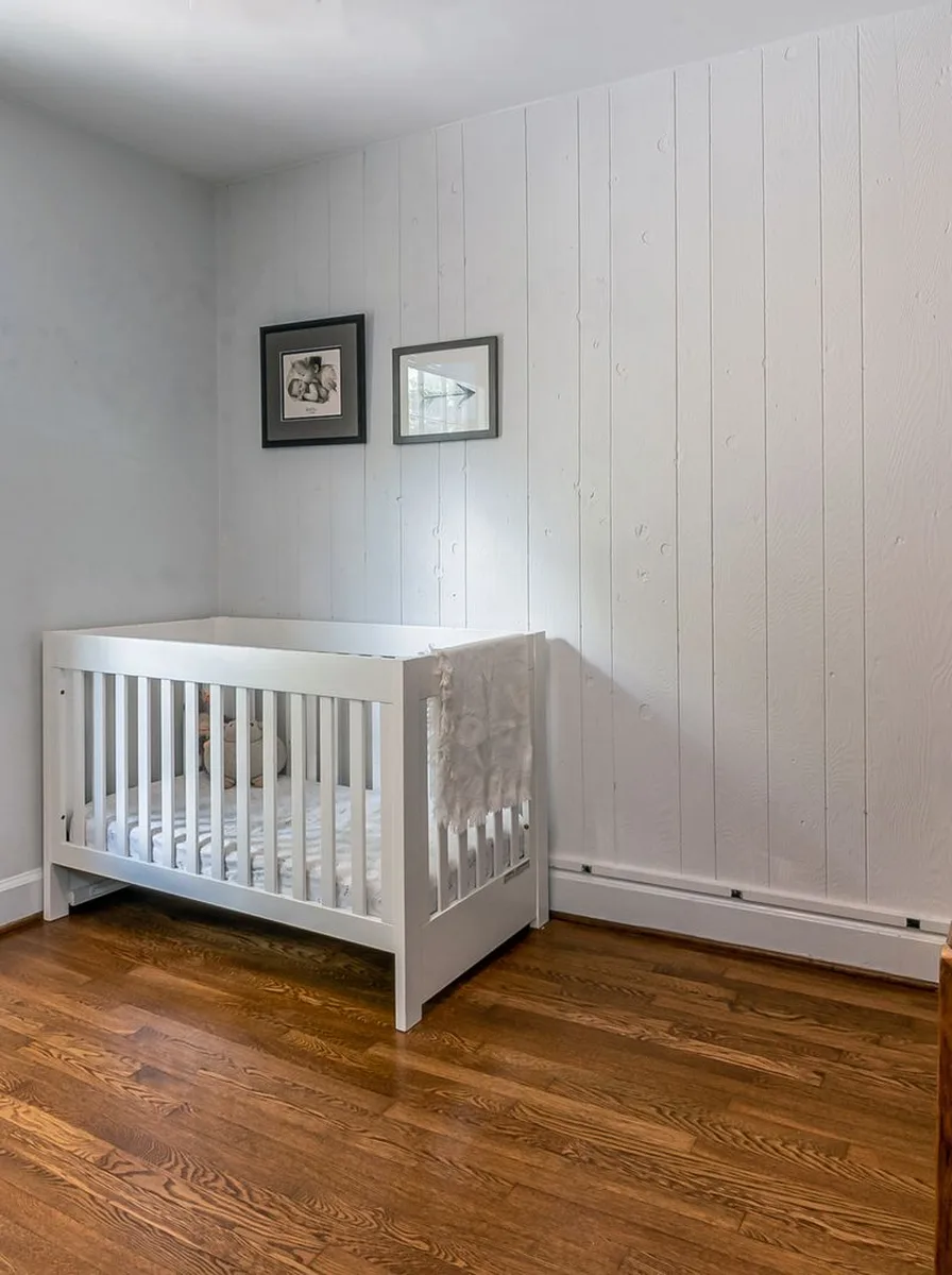
The final step is patience. Paint swatches on large boards, live with them for a few days, and watch how they change from morning to night. Order fabric samples of your rug and curtains and hold them against the wall colour. This slow process prevents the expensive mistake of a full room painted in the wrong tone.
Remember that colour is the easiest thing to change and the hardest to get right blind. A week of testing saves years of mild regret. And once you’ve found your palette, commit confidently — a room designed around a palette you love will feel intentional and beautiful, because it is.
Final palette checklist:
● Test large swatches in the real room, in real light, for several days.
● Check textiles against wall colours before buying.
● Photograph the swatches — cameras reveal clashes eyes miss.
● Trust your gut: the palette that makes you exhale is the right one.