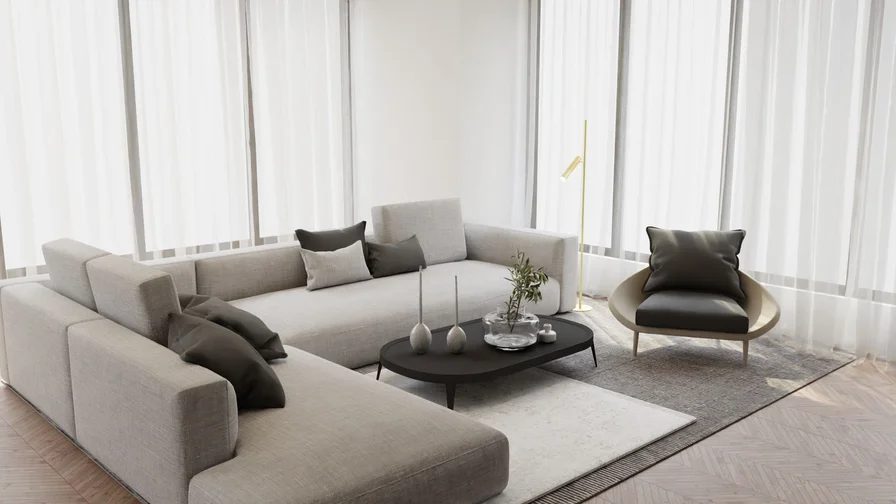
A neutral living room is the safest bet in decorating — and also the most sophisticated.
Ivory, greige, taupe, and warm stone tones never fight each other, never date, and give you a calm backdrop that makes every furniture choice look considered. The trick is that “neutral” is not one color: it is a whole family of warm whites, soft beiges, and stony grays that layer together to create depth without a single loud note. Done well, a neutral room feels expensive, restful, and endlessly flexible — swap one throw or a piece of art and the whole mood shifts.
The secret to keeping neutrals from feeling flat is texture and light.
Smooth marble against nubby linen, velvet against raw wood, a chandelier’s sparkle over a matte rug — these contrasts are what make a beige-on-beige room feel rich instead of boring. Lighting matters too: warm bulbs (around 2700K), layered lamps, and sheer curtains that filter daylight all help neutral tones glow rather than fade. If your room gets cool northern light, lean warm; if it gets strong southern sun, you can go cooler and crisper.
This guide gathers 23 timeless neutral living room ideas that prove beige is anything but boring, each with practical tips you can copy in your own home.
From greige foundations and linen curtains to marble coffee tables and a hotel-calm seating corner, you will find a sophisticated neutral scheme for every style — and every idea here is built to look just as good in ten years as it does today.

1. Build Your Scheme on a Warm Greige Base

Greige — the happy marriage of gray and beige — is the ultimate neutral base because it borrows the best of both: the calm of gray and the warmth of beige. Paint your walls a warm greige and almost every furniture finish works with it, from pale oak to dark walnut. It flatters both cool and warm lighting, which makes it forgiving in rooms with mixed exposures, and it gives art and textiles a quiet backdrop that lets their texture shine.
Choose a greige with a visible warm undertone (think mushroom or putty) rather than a flat mid-gray, or the room can read cold after dark. Sample three shades on the wall and check them in morning and evening light before committing. Pair it with white ceilings and trim for crispness, then layer in cream, camel, and stone textiles to build the scheme upward from the walls.
2. Layer Three Shades of Ivory for Depth

An all-ivory room only works when the ivories are not identical. Layering three shades — say, a warm white wall, a cream sofa, and an oatmeal rug — creates subtle tonal shifts that give the eye places to land. The differences can be tiny; even a half-step between shades reads as depth. This tone-on-tone approach is the fastest route to a room that looks professionally styled, because it mimics how designers build calm, gallery-like spaces.
Keep the lightest shade on the largest surfaces (walls, big sofa) and the deepest on the floor (rug, ottoman) to ground the room. Then break the monotony with texture: a boucle throw, a jute basket, a linen cushion. If you worry the room looks washed out, add one mid-tone — a tan leather stool or a wooden tray — as the “anchor” that stops everything floating.
3. Embrace a Calm Minimalist Neutral Layout
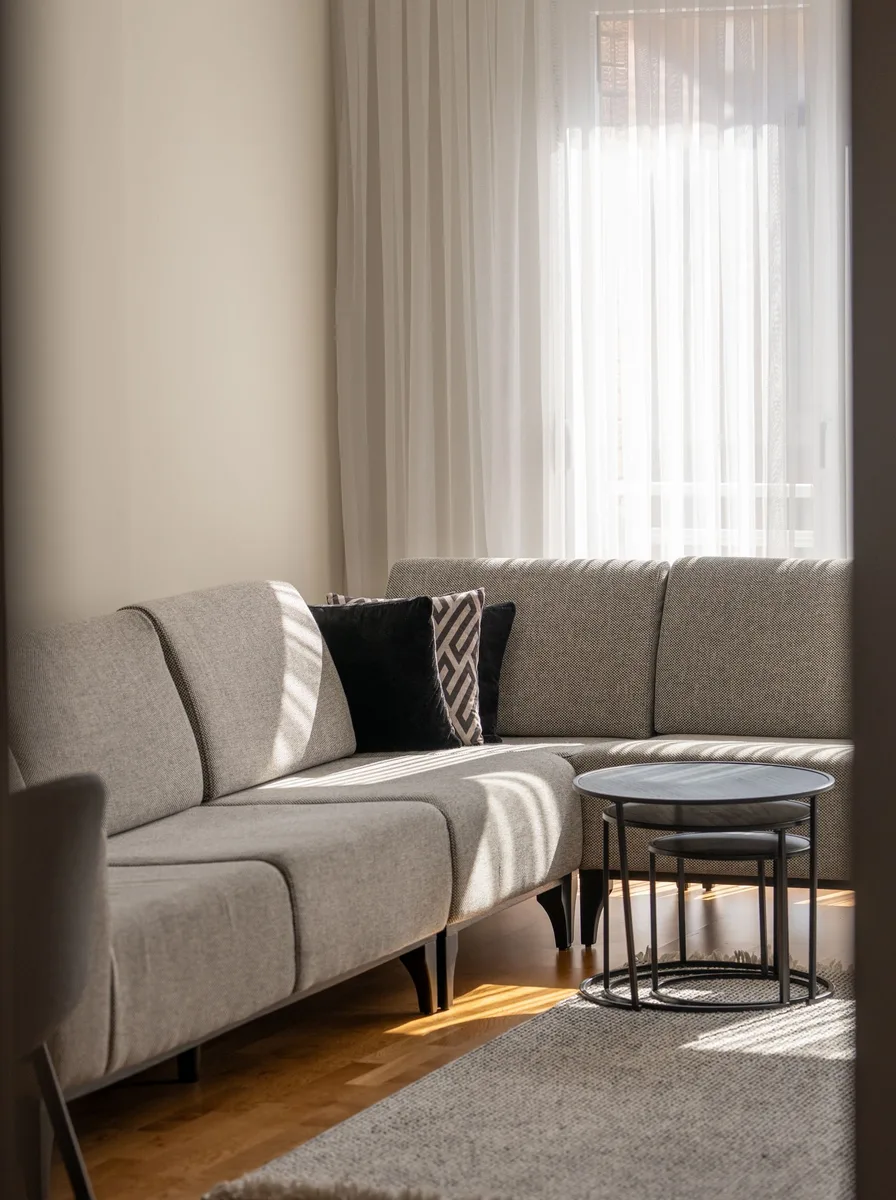
Minimalism and neutrals are natural partners: fewer objects mean fewer visual interruptions, so the room’s calm palette can do the talking. Choose simple silhouettes — a straight-arm sofa, a plain coffee table, one floor lamp — in a tight range of warm whites and beiges, and leave breathing room around each piece. The result feels serene rather than sparse, because every remaining object earns its place.
The discipline is in the editing, not the buying. Remove one thing from every surface, hide the remotes and cables, and keep styling to a single tray or one stack of books. Good storage is non-negotiable — a closed cabinet beats open shelving every time in a minimal scheme. The payoff is a living room that tidies in ten minutes and never looks cluttered, even on a busy week.
4. Hang a Chandelier That Reads Like Jewelry
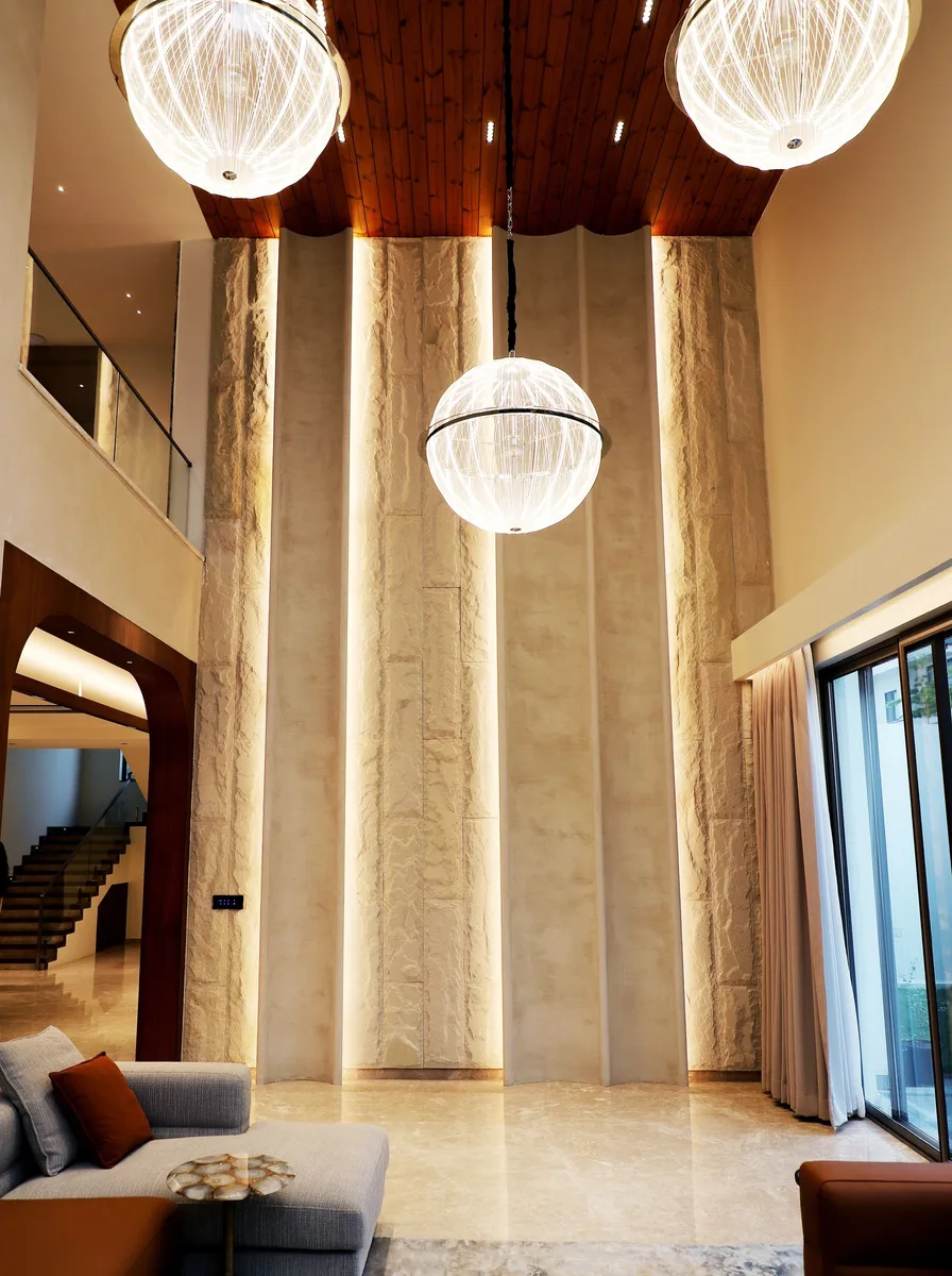
In a quiet neutral room, a chandelier functions like jewelry on a simple outfit — it adds sparkle, scale, and a focal point without changing the palette. Choose one in crystal, brass, or alabaster to keep the tones warm, and size it generously: a chandelier that is slightly too big looks intentional, while one that is too small looks apologetic. Center it over the seating area or coffee table so it anchors the conversation zone.
Hang it so the lowest point sits about seven feet off the floor in a walk-through area, or 30 to 36 inches above a coffee table it hangs over. Put it on a dimmer — chandeliers are at their best glowing low in the evening. In a neutral scheme the fixture’s finish matters: aged brass and soft gold warm the room, while polished chrome can read cold against beige walls.
5. Mix Silk and Linen for a Collected Feel

A sophisticated neutral room is built from fabric contrast: the slight sheen of silk or velvet against the matte dryness of linen. This high-low mix is what makes beige feel curated rather than flat — light catches the silk cushions while the linen sofa absorbs it, and the difference reads as richness. Keep everything in the same tonal family (cream, champagne, oatmeal) and let the finishes do the talking.
Use the rule of three: one smooth (silk or satin cushions), one nubby (boucle or wool throw), one natural (linen or cotton upholstery). Don’t overdo the sheen — two or three silk cushions are enough; a whole silk sofa can look slippery. Washable linen-look covers on the big pieces keep the scheme practical for real life, pets, and red wine.
6. Add a Touch of Luxury with a Travertine Side Table

Travertine is having a moment, and in a neutral living room it is pure gold — literally, its honeyed tones sit perfectly inside a beige palette. A travertine side table or pedestal adds natural stone pattern, a sense of permanence, and a sculptural shape that a plain wooden table cannot match. Because the stone’s veining is subtle, it never fights the room’s calm; it simply elevates it.
Style it sparingly: one sculptural object, one small stack of art books, or a single stem in a bud vase — the stone is the star. Seal the surface if you plan to set drinks on it, since travertine is porous. If real stone is out of budget, travertine-look ceramic tables deliver the same warm pitted texture at a fraction of the price.
7. Create a Hotel-Calm Seating Area

There is a reason hotel lounges feel instantly relaxing: symmetrical seating, plump upholstery, and a strict neutral palette. Copy the formula at home with two matching armchairs facing the sofa, a low coffee table between them, and everything in creams and warm beiges. Symmetry calms the eye, and generous cushioning invites people to actually sit down and stay a while.
The hotel trick is in the details: a folded throw over each chair arm, cushions karate-chopped in the middle, and a low arrangement of coffee-table books. Keep side tables clear except for one lamp and one object each. This look works especially well in open-plan spaces, where a tight, symmetrical seating group defines the “living room” without any walls.
8. Let Tailored Slipcovers Keep It Classic

A tailored slipcover in natural linen is the neutral living room’s secret weapon: it gives any sofa a relaxed, coastal-European polish, and it comes off for washing — the most practical luxury there is. Choose a close-fitting, tailored style rather than a loose throw-on cover; the clean lines keep the room sophisticated instead of shabby. Ivory, oatmeal, or pale stone are the timeless choices.
Order a washable cotton-linen blend so the cover survives real life, and buy a spare set if the sofa gets heavy use — rotating covers doubles their life. Slipcovers also let you refresh the whole room’s tone for the price of fabric: swap oatmeal for white in summer, or add a darker stone for winter. Iron or steam after washing for that crisp, tailored finish.
9. Light a Second Chandelier Over the Reading Corner

One chandelier makes a statement; a second, smaller one over a reading chair makes the room feel designed. A petite chandelier or a cluster of small pendants above an armchair and side table turns a dead corner into the room’s most inviting spot. In a neutral palette the fixture becomes sculpture — choose alabaster, frosted glass, or brass so it glows warm rather than glaring.
Scale down: the second fixture should be clearly smaller than the main one, or the room looks like a lighting showroom. Hang it low enough to pool light over the chair (about five and a half feet off the floor works for reading) and wire it to the same dimmer as the main light. This is also a renter-friendly idea — plug-in pendant kits with fabric cord need no electrician.
10. Ground the Space with a Marble Coffee Table
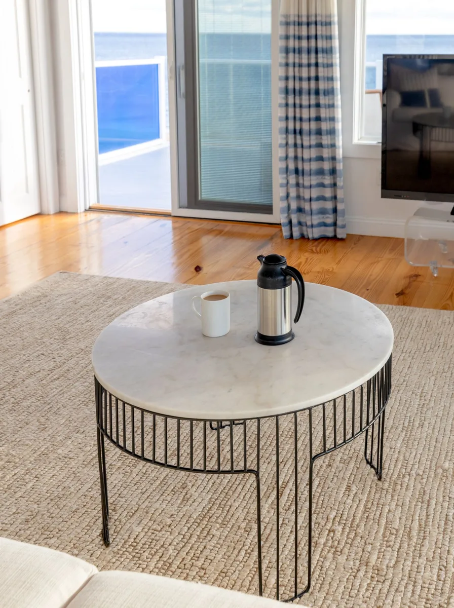
Every sophisticated neutral room needs one cool, hard surface to balance all the soft upholstery — and a marble coffee table is the classic choice. The stone’s natural veining adds pattern without color, its weight anchors a floaty beige scheme, and its cool touch contrasts beautifully with warm textiles. Choose a honed (matte) finish rather than polished for a softer, more current look that also hides fingerprints.
Size the table to about two-thirds the sofa’s length and keep its top two-thirds clear — marble looks best with restraint. Style it with a low stack of books, one sculptural object, and a small tray to corral remotes. Coasters are non-negotiable on marble; the stone etches with acidic drinks. For a budget version, marble-look porcelain tops give the same veined calm at a fraction of the cost.
11. Play with Tone-on-Tone Neutrals
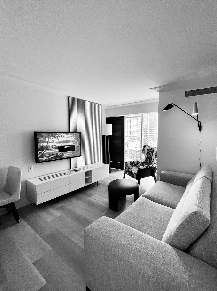
Tone-on-tone decorating — building a room from one color family in many shades — is how designers make neutrals look expensive. Pick your family (warm beiges, say) and use at least five steps from near-white to mid-tan across walls, sofa, rug, curtains, and cushions. The eye reads the subtle shifts as complexity, the same way a black-and-white photograph holds interest without any color at all.
Map the shades before you shop: hold paint chips, fabric swatches, and rug samples together in daylight and check that they genuinely differ — two “almost the same” beiges just look mismatched. Then distribute light and dark evenly so no corner is all-pale or all-dark. One warm metallic (brass, bronze) threaded through lamps and frames ties the whole tonal story together.
12. Choose a Deep-Seat Neutral Sofa
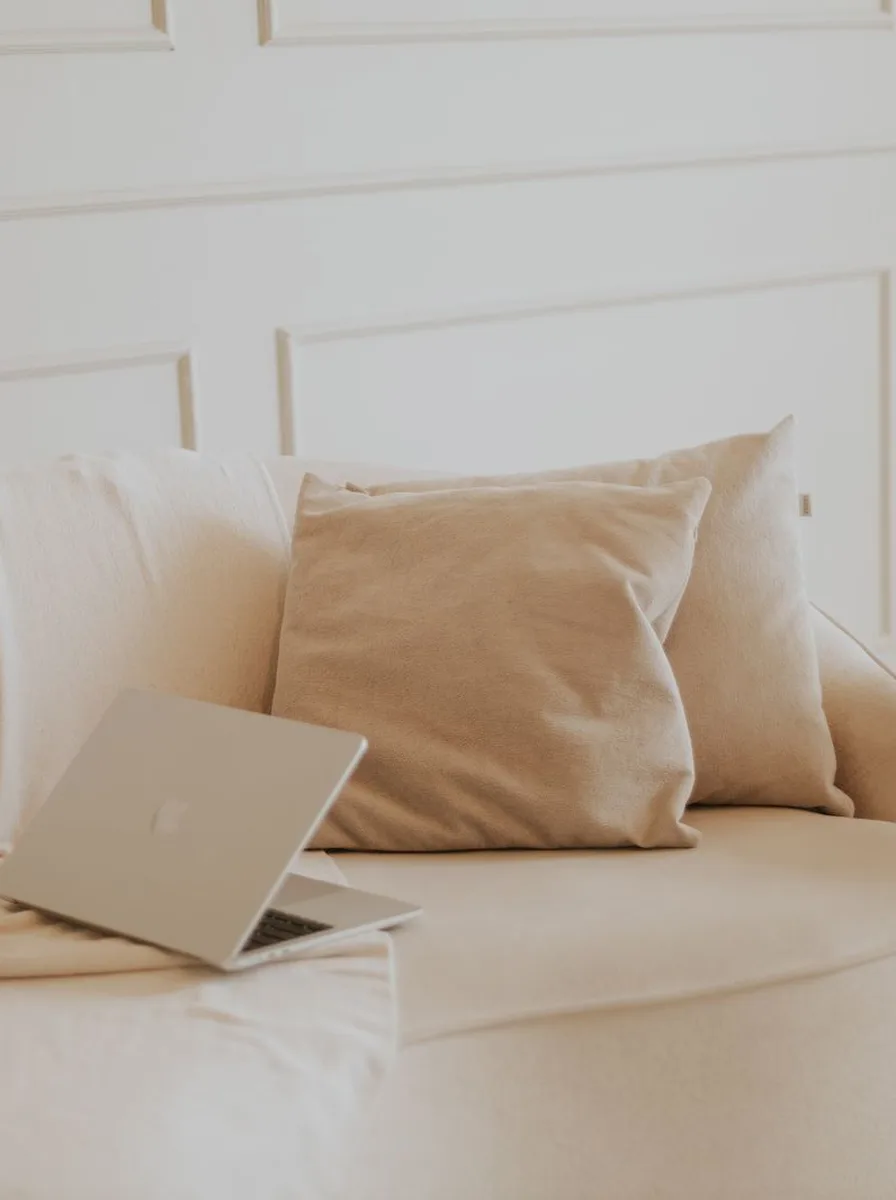
The sofa is the biggest block of color in the room, so in a neutral scheme it sets the tone — literally. A deep-seat sofa in a warm beige or oatmeal performance fabric is the sophisticated choice: generous enough to sink into, tailored enough to look smart. Deep seats (24 inches or more) suit lounging and make a room feel relaxed; shallower seats read more formal. Pick your depth to match how you actually live.
Order fabric swatches and live with them for a week — check them in daylight and lamplight, spill coffee on one, see how it cleans. Performance fabrics with stain resistance are worth every penny in a light color. Keep the sofa’s lines simple (track or slim rolled arms) so it stays timeless, and let cushions in deeper tones do the seasonal updating.
13. Dress Tall Windows in Linen Curtains
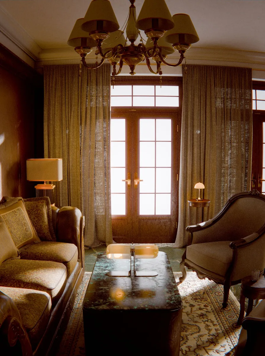
Linen curtains are the neutral living room’s finishing touch: their natural slub and soft drape add texture exactly where the room needs it, at the window. Hang them from ceiling to floor in an ivory or flax tone, and they soften hard window edges, filter daylight into a warm glow, and make ceilings look taller. In a beige scheme they practically disappear — which is the point; they frame the light, not themselves.
Mount the rod six to eight inches above the frame and extend it a foot beyond each side so the curtains stack clear of the glass and the window reads bigger. For fullness, each panel should be one and a half to two times the width it covers. Washable linen or linen-look polyester keeps them practical; steam the panels after hanging for soft, even folds.
14. Anchor a Gallery Wall in Warm Whites
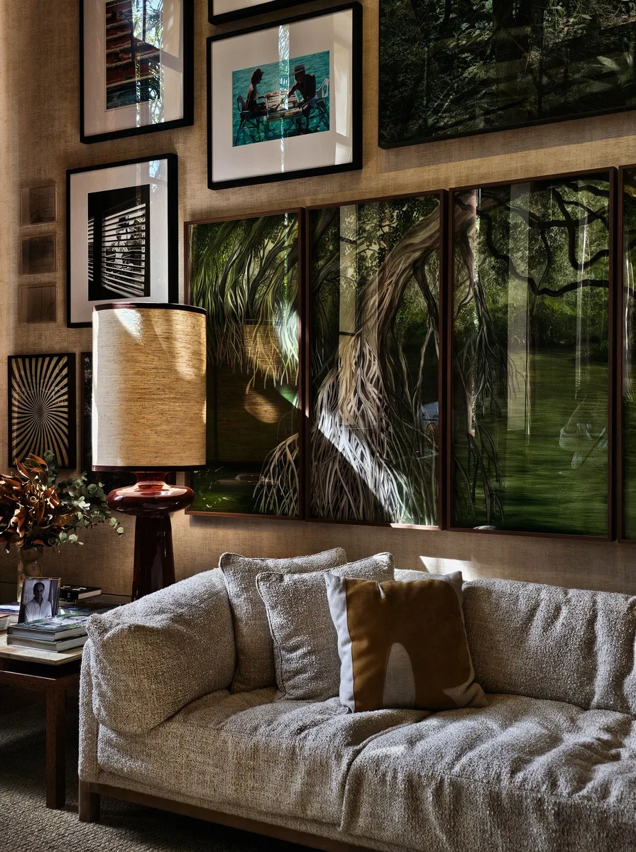
Art gives a neutral room its personality, and a gallery wall in warm-white frames keeps the palette calm while adding all the interest. Mix abstract prints, line drawings, and one or two photographs — all in cream, tan, and soft gray — so the wall reads as texture rather than color. Consistent frames (same finish, varied sizes) are what make a mixed collection look intentional instead of random.
Lay the arrangement on the floor first and photograph it before a single nail goes in. Keep two to three inches between frames and center the whole group at eye level (about 57 inches to the middle). In a neutral room, give the art breathing room: one considered gallery wall beats art scattered on every surface. Paper templates taped to the wall help you commit with confidence.
15. Balance Soft Curves with Straight Lines
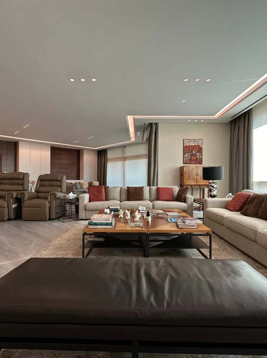
A sophisticated neutral room needs shape contrast to stay interesting: pair a curved boucle armchair with a straight-lined sofa, or a round coffee table with a rectangular rug. The curves soften the room and invite touch; the straight lines keep it tailored and calm. In a palette without strong color, these silhouettes become the design — they are what the eye remembers.
Aim for roughly a 70/30 split: mostly straight, tailored pieces with a few curves (or vice versa) rather than a 50/50 mix that can look indecisive. Good curve candidates are armchairs, ottomans, round side tables, and arched floor lamps. Keep every curve in the same neutral family so the shapes, not the colors, carry the contrast.
16. Design a TV Wall That Disappears

A big black rectangle can wreck a calm neutral scheme — unless you design the wall around it. Mount the TV on a warm greige or panelled wall, flank it with symmetric shelving or art, and it reads as part of the architecture instead of an intruder. Painting the wall a slightly deeper tone than the rest of the room also helps the screen recede when it is off.
Hide the tech: in-wall cable channels, a closed media console for boxes and remotes, and a soundbar mounted flush under the screen. When the TV is off, frame-mode art or a simple neutral screensaver keeps the wall pretty. If you would rather the screen vanish entirely, a frame-style TV with an art-mode display was made for exactly this job.
17. Go Glam with Mirrored and Marble Finishes

Neutral does not have to mean quiet — a little glamour lifts beige into evening-dress territory. Mirrored side tables, a marble console, and brass lamp bases bounce light around the room and add the reflective sparkle that flat neutrals lack. The palette stays calm (ivory, champagne, stone) while the finishes do the entertaining. This is the look for people who want sophisticated but not sleepy.
Restraint keeps glam elegant: pick two reflective finishes maximum (say, mirror plus brass) and repeat them in small doses. One mirrored table, two brass lamps, done — more and the room tips into showroom. Balance the shine with matte textures (a wool rug, linen upholstery) so the eye has somewhere soft to rest.
18. Maximize Daylight with an Open Window Wall
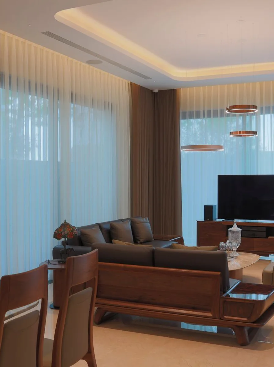
Daylight is the best accessory a neutral room can have — it makes every beige and ivory tone glow and shift through the day. If you have a wall of windows, keep it open: sheer panels instead of heavy drapes, low furniture that never blocks the glass, and a seating layout that faces the view. The windows become the room’s art, and the neutral palette simply frames them.
Manage glare with sheer roller blinds that disappear by day and filter harsh sun at noon. Keep the floor in front of windows clear — no tall plants or stacked baskets blocking the light path. In the evening, mirror the daylight strategy with lamps placed near the windows; lit from within, the glass reflects the room’s warm glow back at you.
19. Try Floor-to-Ceiling Sheer Curtains

Sheers are the neutral room’s daylight filter: they take harsh sun and turn it into a soft, even glow that flatters every beige tone in the room. Floor-to-ceiling sheer panels in warm white make windows look taller, walls look further apart, and the whole space feel airier — all while keeping the palette perfectly calm. Because you can see through them, the window’s depth becomes part of the room.
Choose a voile or sheer linen with a little texture so the panels do not look flimsy, and let them kiss the floor or puddle slightly for a relaxed luxury feel. Layer a discreet roller blind behind for nighttime privacy — invisible by day, practical after dark. Mount the rod as close to the ceiling as possible to maximize the height trick.
20. Double Up Curtain Panels for a Fuller Look

Skimpy curtains ruin an expensive look faster than anything: thin panels pulled flat across a window read as cheap, no matter the fabric. The fix is simple — double the panels. Two panels per side (or one wide panel doubled in fullness) create deep, generous folds that look custom-made. In a neutral palette, that fullness is pure luxury; it is how hotel and designer rooms get their rich, tailored drape.
The math: for pinch-pleat or gathered curtains, buy panels totaling two to two-and-a-half times the rod width. Hang them with rings or back tabs so the folds fall evenly. This is the rare upgrade that costs little — extra panels of the same curtain — but transforms the window from afterthought to focal point. Steam or press after hanging for crisp, even pleats.
21. Keep Silhouettes Clean and Contemporary

Timeless does not mean traditional — a contemporary neutral room with clean, unfussy silhouettes ages just as gracefully. Think track-arm sofas, slab coffee tables, and drum-shade lamps in warm whites and pale woods. Without ornate details to date them, these simple shapes let the material quality shine: the grain of oak, the weave of boucle, the honed surface of stone.
Keep the color story tight — three neutrals maximum — and let one natural material be the star, like pale oak flooring running wall to wall. Add warmth through textiles rather than extra colors: a camel throw, a sheepskin over the chair, a jute rug underfoot. Contemporary neutral rooms photograph beautifully and, more importantly, live beautifully — nothing to dust in the crevices.
22. Frame One Oversized Art Piece
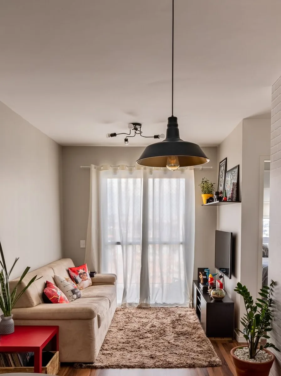
When the palette is quiet, scale can be loud. One oversized piece of art — an abstract in creams and tans, a large-scale photograph, a textured canvas — gives a neutral room its confident focal point without introducing a single new color. Big art also makes rooms feel bigger: the eye reads one large gesture as spacious, where many small frames can read as busy.
Size it right: the art should span roughly two-thirds the width of the sofa or console below it. Hang the center at eye level and give it a generous frame in natural wood or slim black. In a neutral scheme, texture in the art (plaster, heavy impasto, woven textile) matters more than subject — it is the surface variation that keeps beige interesting.
23. Finish with a Neutral Gallery Grid

End your neutral scheme with the most orderly art display of all: a symmetrical grid of matching frames. Six or nine identical frames in a tight grid — filled with abstract prints, botanical studies, or black-and-white photography in sepia tones — bring architectural calm to a blank wall. The repetition is soothing, the symmetry is sophisticated, and the uniform palette keeps everything serene.
Use identical frames and identical mat widths; the grid only works when it is disciplined. Space frames two inches apart and use a laser level — crooked grids defeat the purpose. This is a brilliant solution for a large empty wall, a hallway-adjacent living area, or above a long low console. When you tire of the images, swap the prints and keep the frames: instant refresh, zero new holes.