

A gallery wall is a home’s autobiography written in frames: the art you love, the places you have been, the people who matter.
Done well, it turns the most boring wall in the house into the most interesting one — a layered, personal composition that no single piece of art could achieve. Done badly, it is just clutter with nails. The difference is entirely in the planning.
The good news is that gallery walls follow a few simple rules, and once you know them, you can break them beautifully.
Unity — of frame, of colour, or of theme — is what separates a masterpiece from a mess. Beyond that, it is pure personal expression, and the wall becomes more you with every piece you add.
These 24 creative gallery wall ideas cover every approach, from classic salon hangs to modern ledges and mixed-media compositions.
Each is shown in a real-style setting with layout tips — find the approach that fits your wall, your art, and your story.
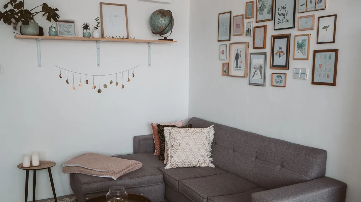
1. Master the Classic Salon Hang

The salon hang — frames of all sizes fitted together floor to near-ceiling — is the most dramatic gallery wall there is. It turns a whole wall into art, filling awkward large spaces with personality. The density is the point: generous, abundant, and unapologetically maximal.
Start with your largest piece slightly off-centre, then build outward, keeping gaps consistent at 5 to 8cm. Lay everything on the floor first and photograph the arrangement. Unify with a limited frame palette — say, black and natural wood — so the variety feels curated.
2. Try a Perfect Grid

For a calm, tailored look, nothing beats a grid: identical frames, identical spacing, perfect alignment. A grid of black-and-white photographs or botanical prints brings order and quiet confidence to a wall. It is the gallery wall for minimalists and perfectionists.
Measure obsessively — the crispness is the whole effect. Use a laser level and a hanging template. Grids work best with a single image type; mixing subjects breaks the spell. Four, six, or nine frames are the classic counts.
3. Use Picture Ledges for Flexibility
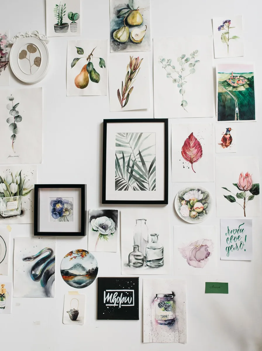
Picture ledges let you layer frames without a single nail hole per frame — art leans, overlaps, and can be rearranged on a whim. It is the gallery wall for commitment-phobes and seasonal stylists. The layered depth looks relaxed and effortlessly stylish.
Install two or three ledges with 30 to 40cm between them. Overlap frames of different sizes, leaning larger ones at the back. Add small objects — a vase, a stack of books — between frames for a collected feel. Dust the ledges; they show it.
4. Go Monochrome for Calm

A gallery wall in a single colour story — all black-and-white photography, all sepia tones, all line drawings — has a serene, museum-like quality. Removing colour competition lets composition and subject shine. It suits bedrooms and hallways where calm matters.
Vary the sizes and orientations for interest, but keep frames identical. White mounts on every piece give the collection breathing room and a professional finish. The restraint is what makes it feel expensive.
5. Mix Art with Personal Photos
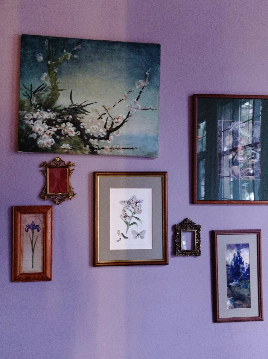
The most meaningful gallery walls blend fine art with family snapshots — a fleeting holiday photo beside a proper print. This mix is what makes a wall feel like a home rather than a showroom. The trick is unifying them: convert photos to black and white, or use matching frames.
Give the art slightly grander frames and the photos simpler ones, or vice versa — a subtle hierarchy adds sophistication. Include one or two non-photo elements, like a small textile or a postcard, for texture and surprise.
6. Add Sculptural Objects
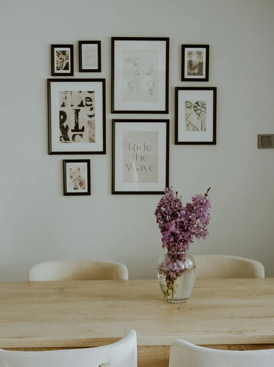
Gallery walls need not be flat. Woven baskets, ceramic plates, hats, or small wall sculptures mixed among frames add dimension that makes the whole composition feel collected and artistic. The shadows they cast give the wall a living quality.
Keep sculptural pieces to about a third of the arrangement so the wall still reads as a gallery. Hang them at varying depths using different nail lengths. This approach shines in dining rooms and living rooms where texture is welcome.
7. Create a Staircase Gallery
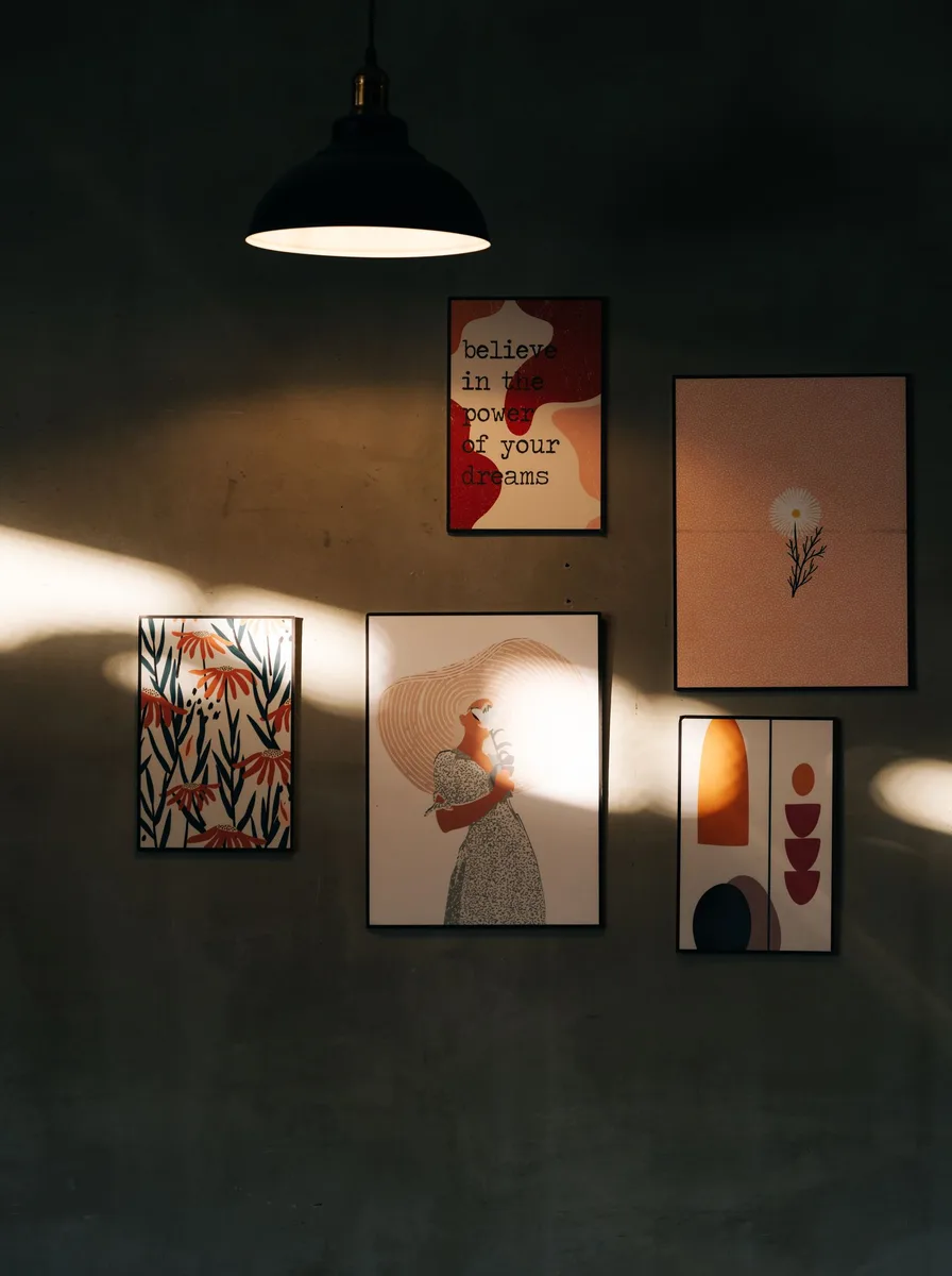
Staircase walls are made for galleries: the diagonal line of the stairs gives you a natural composition guide. Hanging art that rises with the steps turns a transitional space into a destination. It is one of the highest-impact, lowest-cost upgrades in any home.
Follow the stair angle with the centre line of your frames, keeping the bottom of each frame about 150cm above its step. Mix orientations to echo the movement. Family photos work beautifully here — the ascent becomes a timeline.
8. Frame Children’s Art Like Masters
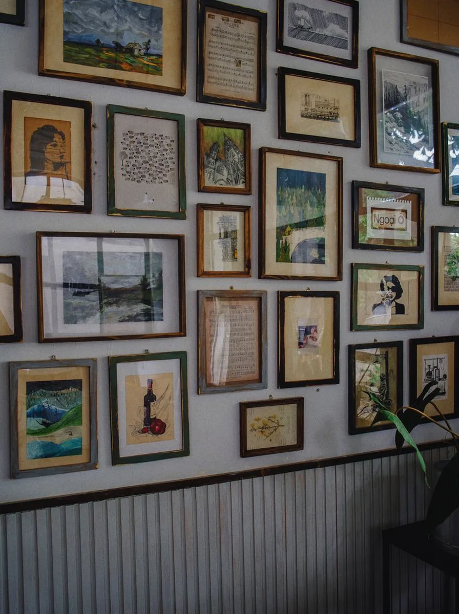
Children’s artwork, properly framed with generous mounts, looks astonishingly like modern art — because in spirit, it is. A gallery of kids’ creations in smart frames is joyful, personal, and a fraction of the cost of bought art. It also makes small artists feel enormously proud.
Use identical frames with wide white mounts to give each piece gallery gravitas. Rotate the display as new masterpieces arrive. Hang at the children’s eye level in their rooms, at adult height in shared spaces.
9. Go Oversized with Two or Three Pieces

Sometimes the boldest gallery is the sparsest: two or three oversized pieces with generous space between them. This approach suits large art and calm rooms — each piece gets room to breathe, and the wall feels curated rather than crowded. Less, but bigger.
Scale the art to the wall: each piece should be at least 60cm in its smallest dimension on a large wall. Keep frames minimal or go frameless with canvas. The negative space is part of the composition — do not be tempted to fill it.
10. Try a Corner-Wrapping Gallery

Letting a gallery wall wrap around a corner is an unexpected move that makes a room feel designed by a professional. The composition flows from one wall to the next, softening the corner and making the art feel abundant. It works brilliantly in reading nooks and small living rooms.
Treat the two walls as one canvas when laying out on the floor. Keep the spacing consistent across the corner. It is a strong look, so keep the frame palette tight — one or two finishes maximum.
11. Unify with Matching Frames
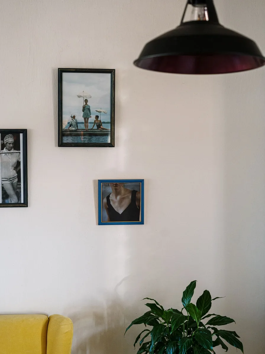
When the art is eclectic, matching frames bring order. Identical thin black frames, for instance, can unite a flea-market print, a child’s drawing, and a vintage map into a coherent collection. The frame becomes the common language.
This is the easiest way to make a mixed collection look intentional. Buy frames in bulk for consistency, and use the same mount colour throughout. The art provides the variety; the frames provide the calm.
12. Add a Statement Clock or Mirror
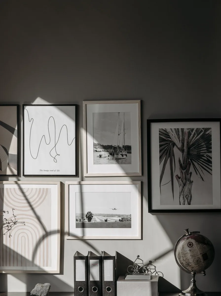
Breaking a gallery wall with one non-art element — a beautiful clock, a round mirror — adds function and focal interest. The interruption stops the wall feeling like a formula and gives the eye a place to rest. It is the gallery equivalent of a pause in music.
Place the statement piece slightly off-centre for a dynamic composition. Choose something with a strong silhouette that holds its own among frames. A mirror also bounces light into the arrangement, brightening the whole wall.
13. Go Floor to Ceiling
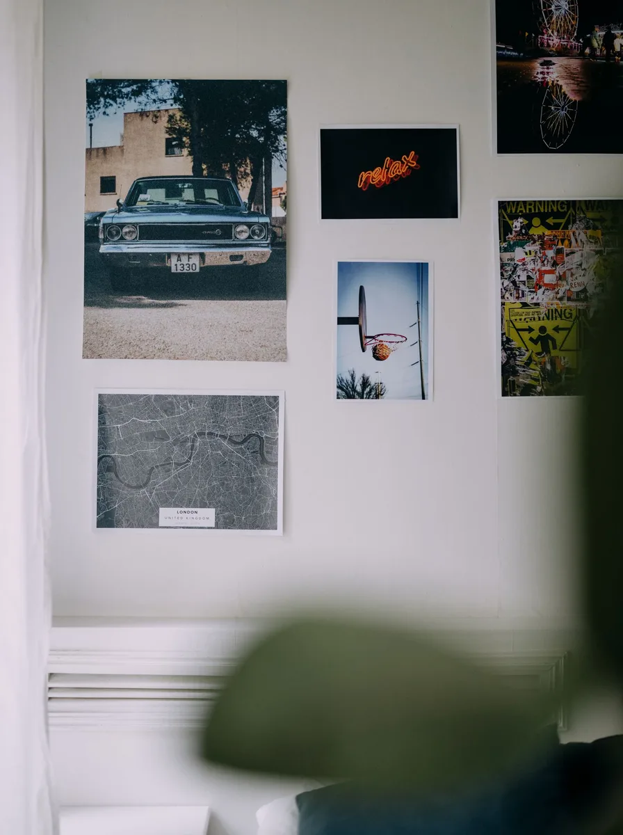
A gallery wall that runs from skirting to cornice is pure drama — the maximalist masterpiece. It makes ceilings feel higher, rooms feel grander, and awkward tall walls feel intentional. This is the approach for entrance halls and double-height spaces.
Anchor the composition with the largest pieces at eye level, then fill up and down. You will need a sturdy step ladder and patience. Keep a consistent gap size throughout — precision matters more as the wall gets bigger.
14. Theme It: Travel Memories
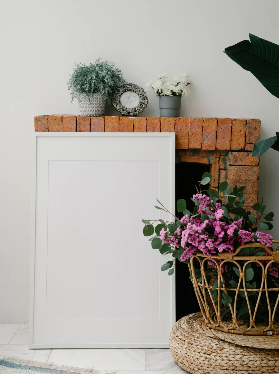
A travel-themed gallery — maps, tickets, photos, prints from beloved places — turns a wall into a personal atlas. It is storytelling through decor, and it sparks conversation like nothing else. Group by trip or by colour for cohesion.
Mix ephemera with proper art: a framed boarding pass beside a landscape print is charming. Use shadow boxes for three-dimensional souvenirs. Leave space to grow — the best travel walls are never finished.
15. Theme It: Botanical Collection

A botanical-themed gallery — pressed flowers, vintage plant prints, leaf photography — brings calm, organic beauty to a wall. The shared subject matter creates harmony even with varied frames and sizes. It suits bedrooms, bathrooms, and kitchens beautifully.
Stick to a restrained palette — greens, creams, soft browns — for maximum serenity. Real pressed botanicals in float frames add an authentic, delicate touch. Group in odd numbers for a natural, unstructured feel.
16. Hang Art Above a Console Table
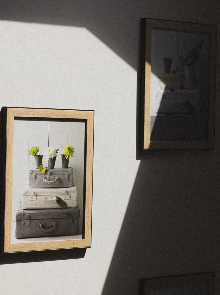
A gallery wall anchored by a console table below it feels grounded and intentional — the table gives the composition a base, like a plinth. Style the table simply: a lamp, a small stack of books, one sculptural object. The wall and table become one vignette.
The bottom of the lowest frame should sit 15 to 20cm above the tabletop. Centre the arrangement over the table, or align it deliberately off-centre for a modern feel. This is the classic entryway formula for good reason.
17. Mix High and Low Art
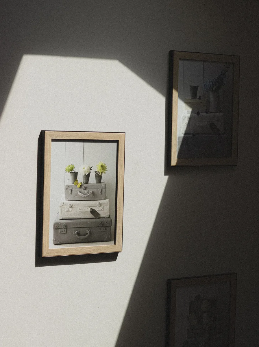
The most interesting gallery walls pair a charity-shop find with a proper investment piece — the contrast is what makes them feel personal rather than purchased. A £5 flea-market landscape in a good frame can hold its own beside real art. Confidence is the only requirement.
Unify with framing: good frames elevate everything. Hang the mix with the same care you would a single expensive piece — spacing and alignment signal intention. Never apologise for the cheap finds; they are often the most loved.
18. Add Typography and Quotes

Letterpress prints, meaningful quotes, or single beautiful words add a graphic, personal layer to a gallery wall. Typography brings rhythm and message — it is the wall speaking directly. Keep it to one or two text pieces so the wall does not become a billboard.
Choose type-led art in colours already present in the arrangement. Hand-lettered or letterpress pieces feel more artful than mass-produced quote prints. Make sure the words mean something to you — sincerity reads.
19. Light It Like a Gallery

Picture lights or small spotlights transform a gallery wall after dark, giving it the hushed drama of a real gallery. Light brings out texture, deepens colours, and makes the whole composition feel important. It is the finishing touch most homes skip.
Battery-operated picture lights now rival wired ones and install in minutes. Aim for one light per two to three frames, washing the wall evenly. Warm light flatters art; cool light flattens it.
20. Go Asymmetric and Modern
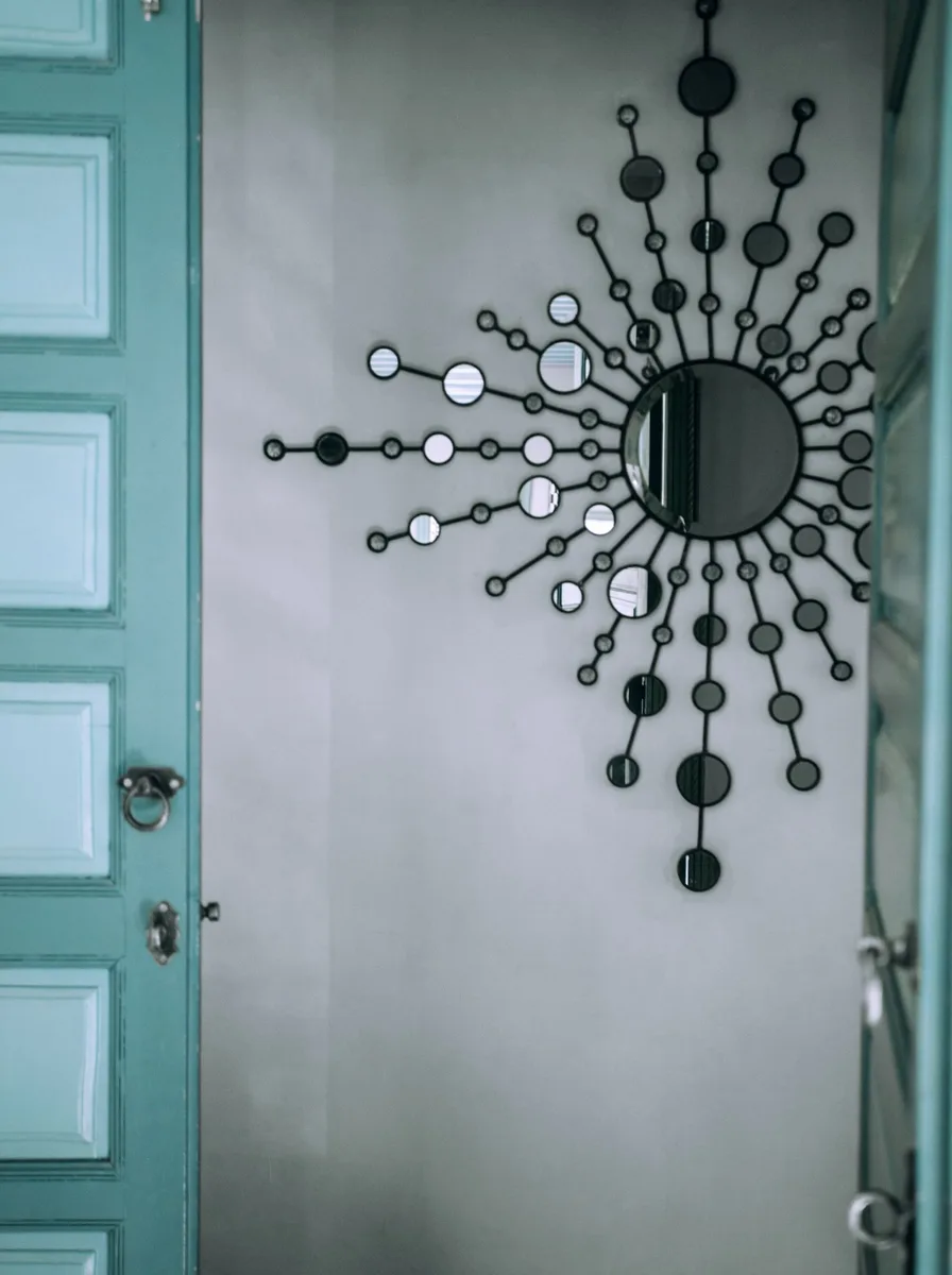
An deliberately asymmetric gallery — frames clustered to one side, generous empty space elsewhere — feels contemporary and confident. It suits modern interiors where negative space is part of the design. The imbalance is the interest.
Anchor the cluster with one large piece, then arrange smaller frames in a loose constellation around it. Keep the empty space truly empty — the contrast is the point. This works beautifully above low, long furniture like sideboards.
21. Frame Fabric and Textiles
Framed textiles — a beautiful scarf, a piece of vintage fabric, an embroidered sampler — add pattern and softness that paper art cannot. In float frames or simple box frames, textiles look surprisingly gallery-worthy. It is an unexpected, personal choice.
Stretch the textile over acid-free board to keep it flat, or let it drape naturally in a deep frame for texture. Choose pieces with colours that echo the room. This is a wonderful way to display travel finds and heirlooms.
22. Create a Mini Gallery in a Small Space

Gallery walls are not just for grand walls — a tight cluster of small frames can transform a tiny hallway, a loo, or the wall beside a door. Small-space galleries feel like jewellery boxes: precious, detailed, and delightful. Scale down, do not give up.
Use frames no larger than 20cm and keep the cluster tight — a 60cm square can hold six to nine pieces. Unify with one frame finish. Small spaces reward close looking, so choose detailed, interesting pieces.
23. Refresh Seasonally

The best gallery walls are never finished — they evolve. Swapping a few pieces seasonally, or adding to the collection over years, keeps the wall feeling alive and personal. A gallery wall should grow the way a home does: gradually and with love.
Leave breathing room in the initial layout for future additions. Keep a small stash of frames ready for new finds. Photograph the wall each time you change it — watching it evolve is one of the quiet joys of a personal home.
24. Finish with the Right Hanging Hardware
The unglamorous secret of great gallery walls is proper hardware: the right hooks for the weight, a level, and painter’s tape for planning. Walls full of extra holes and crooked frames ruin even beautiful art. Invest an hour in technique.
Use paper templates taped to the wall to perfect the layout before a single nail goes in. Two hooks per large frame keep things level forever. Fill old holes and touch up paint when you rearrange — the wall deserves the same care as the art.